Printing for All: Elevate Your Event with Accessible Branding!
October 29, 2025
Imagine walking into an event, brimming with excitement, only to realize that the branding materials—the signs, flyers, brochures—are impossible for you to read or understand. For millions of people with disabilities, this is a daily reality. But it doesn’t have to be this way.
What if your event branding could be a beacon of inclusivity, welcoming everyone with open arms? What if your printed materials could convey your message to every person, regardless of their abilities? Achieving accessibility in printed materials isn’t just a possibility—it’s a powerful way to ensure that your message truly resonates with everyone.
Let’s explore how you can make your printed materials accessible, ensuring that your next event is not only memorable but also inclusive.
Why Accessibility in Printed Materials Matters
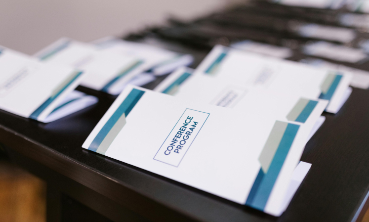
Printed materials are the visual voice of your event. They guide your attendees, inform them, and create a lasting impression. But if these materials aren’t accessible, you risk alienating a significant portion of your audience.
When you make accessibility a priority, you’re not just complying with standards—you’re making a statement that everyone is welcome. Accessible printed materials enhance the experience for people with disabilities, whether they’re navigating your event space, reading your flyers, or engaging with your brand.
Here’s how you can create printed materials that are as inclusive as they are impactful.
1. Prioritize Readability with Clear, Legible Fonts
Your printed materials are only effective if they can be read by everyone. Choosing the right font is crucial to achieving this. Fonts that are too fancy, too small, or too condensed can be difficult for people with visual impairments to read.
Your Action: Use simple, sans-serif fonts like Arial, Helvetica, or Verdana. Ensure that your font size is large enough—preferably at least 12-14 points for body text, with headings at least 16-18 points. Avoid using all caps, which can be harder to read.
Impact: Clear, legible fonts make your materials accessible to a wider audience, ensuring that your message is easy to read and understand.
2. Create Contrast That Stands Out
Colors bring your printed materials to life, but poor contrast can make text hard to read for people with visual impairments, especially those with low vision or color blindness.
Your Action: Use high-contrast color combinations, such as black text on a white background, or white text on a dark background. The WCAG (Web Content Accessibility Guidelines) recommend a contrast ratio of at least 4.5:1 for normal text and 7:1 for large text (18pt and above).
How to Measure: You can use online tools like the WebAIM Contrast Checker to verify if your color combinations meet these standards.
Impact: Strong contrast not only enhances readability but also ensures that your materials stand out, grabbing attention for all the right reasons.
3. Make Key Information Accessible Through More Than Just Color
Imagine you’re looking at a graph with two lines—one red, one green. If you can’t distinguish between these colors, you’re lost. Relying solely on color to convey information can exclude people with color blindness or visual impairments.
Your Action: Use patterns, textures, or labels in addition to color. For example, in graphs or charts, use different line styles (solid, dashed) along with colors to distinguish between elements.
Impact: By providing multiple ways to interpret your materials, you’re ensuring that everyone can access and understand the key information, regardless of their visual abilities.
4. Use Simple, Clear Language
Complex language can be a barrier to understanding, especially for people with cognitive disabilities. The clearer your language, the more accessible your message.
Your Action: Use straightforward language, short sentences, and active voice. Aim for a reading level that is easily understood by a broad audience—around the 8th-grade reading level is a good benchmark. Avoid jargon, technical terms, or complex vocabulary that might confuse readers.
Impact: Clear communication makes your materials accessible to a broader audience, ensuring your message is easily understood by everyone.
5. Provide Braille and Large Print Versions
Printed materials aren’t just about visual appeal—they’re about conveying information. For people who are blind or have low vision, standard print materials can be inaccessible.
Your Action: Offer Braille versions of important materials, such as event programs or flyers. Additionally, provide large print versions with text at least 18-20 points in size.
Impact: By offering Braille and large print options, you’re making sure that your message reaches everyone, reinforcing your commitment to inclusivity.
6. Keep Layouts Simple and Structured
A cluttered or complex layout can overwhelm readers, especially those with cognitive disabilities or low vision. A clean, structured design is key to accessibility.
Your Action: Use a logical layout with clear headings, bullet points, and ample white space. Avoid cramming too much information onto one page. Ensure that important elements are easy to find and navigate.
Impact: A well-organized layout makes your materials more accessible and engaging, allowing everyone to navigate your content with ease.
7. Incorporate Tactile Elements for Inclusivity
Think about how people who are blind or have low vision experience printed materials. Tactile elements, such as raised diagrams or textured areas, can make a world of difference.
Your Action: Where possible, include tactile elements in your printed materials. This could involve raised diagrams or maps that help people navigate, or tactile markers indicating important landmarks such as QR codes or orientation guides for holding the material correctly.
Impact: Tactile elements enhance accessibility, allowing everyone to engage with your materials in a meaningful way.
8. Offer Digital Alternatives with QR Codes
Even the best printed materials can’t cover all accessibility needs. Offering digital alternatives provides flexibility and further enhances accessibility.
Your Action: Include QR codes on your printed materials that link to digital, accessible versions. Make sure these digital files are optimized for screen readers and include features like alt text for images and proper tagging.
Impact: QR codes provide an easy way for everyone to access your materials in the format that works best for them, whether they need a screen-reader-friendly PDF or a large-print version.
9. Test Your Materials with Real Users
Even the most well-designed materials can have accessibility issues that you might not notice. The best way to ensure accessibility is to test your materials with people who have disabilities.
Your Action: Before finalizing your materials, seek feedback from individuals with disabilities. This could include people with visual impairments, cognitive disabilities, or other conditions that affect how they interact with printed content.
Impact: Real-world testing ensures that your materials are genuinely accessible, giving you confidence that everyone will be able to engage with your event.
The Accessibility Checklist for Printed Materials
Before you send your materials to print, run through this checklist to make sure they’re as inclusive as possible:
- Legible Fonts: Are you using clear, readable fonts at an appropriate size (at least 12-14 points for body text and 16-18 points for headings)?
- High Contrast: Does your text stand out against the background with strong contrast? Have you met the recommended contrast ratio (4.5:1 for normal text, 7:1 for large text)?
- Accessible Information: Are you using more than just color to convey key information?
- Clear Language: Is your language simple and easy to understand, targeting around an 8th-grade reading level?
- Alternative Formats: Have you provided Braille or large print versions?
- Simple Layouts: Is your design clean, organized, and easy to navigate?
- Tactile Elements: Have you included tactile features for diagrams, maps, or important landmarks?
- Digital Alternatives: Have you included QR codes to provide accessible digital versions?
- User Testing: Have you tested your materials with real users who have disabilities?
Conclusion: Building a More Inclusive World, One Print at a Time
Accessible printed materials aren’t just about compliance—they’re about creating an inclusive experience for everyone who interacts with your brand. By following these steps, you’re ensuring that your message reaches every person, regardless of their abilities.
When you make accessibility a priority, you’re not just enhancing your materials—you’re making a powerful statement about your commitment to inclusivity. Start applying these tips to your printed materials today, and watch how your events become more welcoming, engaging, and successful.
Let’s work together to build a world where everyone is included—one print at a time.
This blog is designed to inspire and guide you in creating accessible printed materials. By implementing these best practices, you’re not only making your events more inclusive—you’re setting a new standard for what it means to communicate effectively with everyone.