
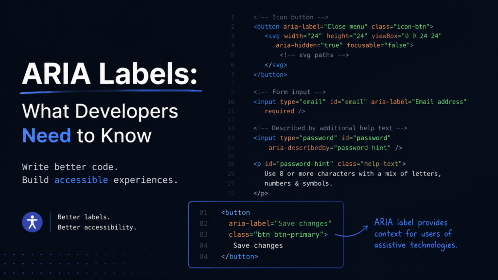
ARIA Labels: What Developers Need to Know
June 29, 2026
By Yashika Goyal
Most developers learn accessibility and immediately reach for aria-label.
Need a label? Add aria-label.
Need a screen reader announcement? Add aria-label.
Unfortunately, many accessibility bugs are caused by using aria-label when it isn’t needed.
The goal isn’t to add more ARIA. The goal is to provide the correct accessible name.
What is aria-label?
aria-label provides an accessible name for an element when no visible label is available.
<button aria-label=”Close”>
✕
</button>
A screen reader announces:
Close button
This is useful because the visible content (✕) doesn’t clearly describe the button’s purpose.
Understand Accessible Names First
Every interactive control should have an accessible name.
Examples:
Element | Accessible Name |
Button | Save |
Link | View Details |
Checkbox | Subscribe |
Textbox | Search |
Screen readers typically announce:
Accessible Name + Role + State
Example:
Subscribe checkbox checked
The accessible name can come from:
- Visible text
- <label>
- aria-labelledby
- aria-label
This is important because aria-label is only one of several ways to name a control.
The Most Common Mistake
Developers often do this:
<button aria-label=”Add to Cart”>
Add to Cart
</button>
The button already has visible text.
The browser already knows its name is “Add to Cart”.
The aria-label adds no value.
Even worse:
<button aria-label=”Purchase Product”>
Add to Cart
</button>
Now:
- Sighted users see “Add to Cart”
- Screen reader users hear “Purchase Product”
Two different labels for the same control create confusion.
Prefer Native HTML First
Good:
<button>Continue</button>
Good:
<label for=”email”>Email Address</label>
<input id=”email”>
Avoid replacing native labels with ARIA unless there’s a genuine need.
Native HTML is usually the most reliable accessibility solution.
aria-labelledby vs aria-label
Many developers use aria-label when aria-labelledby is actually the better choice.
Using aria-label
<button aria-label=”Search”></button>
Using aria-labelledby
<span id=”search-label”>Search</span>
<button aria-labelledby=”search-label”></button>
Benefits of aria-labelledby:
- Reuses visible text
- Easier maintenance
- Better localization support
- Keeps visual and accessible labels synchronized
If visible text already exists, aria-labelledby is usually preferred.
Hidden Text vs aria-label
Many accessibility guides recommend visually hidden text:
<button>
<span class=”sr-only”>Search</span>
<svg aria-hidden=”true”></svg>
</button>
This works well because the hidden text becomes part of the button’s accessible name.
TalkBack announces:
Search button
No extra swipe is created because the hidden text is inside the control.
The Mobile Screen Reader Nuance
This is something many accessibility articles don’t discuss.
If hidden text is exposed separately in the accessibility tree, TalkBack may create an additional navigation stop.
Example:
<span id=”filter-label” class=”sr-only”>
Beige with 228 items
</span>
<input
type=”checkbox”
aria-labelledby=”filter-label”
/>
In some mobile scenarios, users may encounter:
Beige with 228 items
Swipe
Beige checkbox not checked
Instead of:
Beige with 228 items checkbox not checked
This means:
- More swipes
- Slower navigation
- Poorer experience on large filter lists
For mobile web, an important question isn’t just:
Is the hidden text accessible?
It’s:
Does the hidden text create an extra swipe stop?
When visible text already exists, many accessibility engineers prefer:
<span id=”beige-label”>
Beige (228)
</span>
<input
type=”checkbox”
aria-labelledby=”beige-label”
/>
or
<input
type=”checkbox”
aria-label=”Beige with 228 items”
/>
Both approaches usually result in a single navigation stop.
Icon Buttons: A Perfect Use Case
<button aria-label=”Search”>
<svg aria-hidden=”true”></svg>
</button>
Without the label, many screen readers simply announce:
Button
With the label:
Search button
This is exactly what aria-label was designed for.
Be Careful with Forms
Bad:
<input
placeholder=”Search”
aria-label=”Search”
/>
Placeholders are not labels.
Better:
<label for=”search”>
Search
</label>
<input id=”search”>
Use aria-label only when a visible label truly isn’t possible.
When to Use aria-label
✅ Icon-only buttons
✅ Icon-only links
✅ Custom controls without visible labels
✅ Situations where no visible label exists
When Not to Use aria-label
❌ When visible text already labels the control
❌ When a native <label> exists
❌ When aria-labelledby can reference visible content
❌ As a replacement for proper HTML semantics
A Practical Rule for Developers
When naming a control, follow this order:
- Native HTML (<button>, <label>, etc.)
- Visible text + aria-labelledby
- Visually hidden text (if it won’t create extra navigation stops)
- aria-label
The best accessibility solutions are usually the simplest ones.
Before adding aria-label, ask yourself:
Does this control already have a meaningful accessible name?
If the answer is yes, you probably don’t need it. If the answer is no, aria-label may be exactly the right tool.