
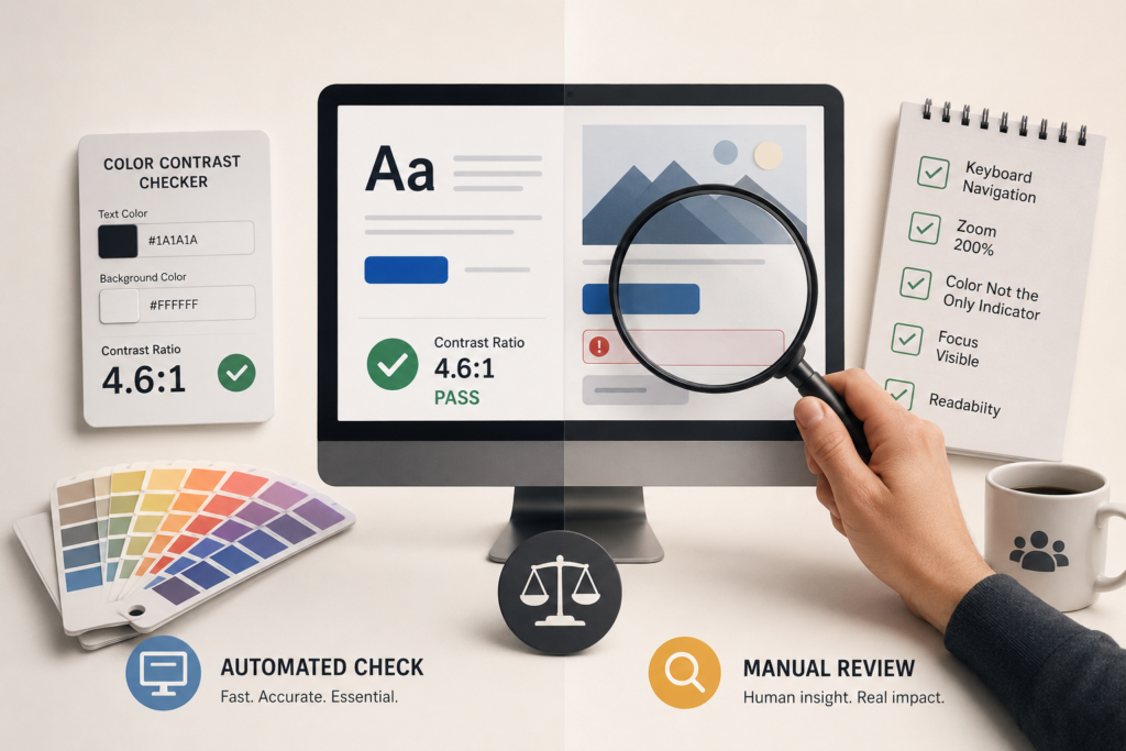
Color Contrast Checker vs Manual Review: Why You Need Both for Better Accessibility
July 10, 2026
By Gokul Gopi
Introduction
When people start improving website accessibility, one of the first tools they use is a color contrast checker. These tools are quick, free, and easy to use. They tell you whether your text and background colors meet accessibility standards.
But here’s the thing. Passing a color contrast checker doesn’t always mean your content is truly accessible.
A manual review is just as important. It helps you find problems that automated tools simply can’t detect.
In this article, we’ll compare color contrast checkers vs manual reviews, explain what each one does, and show why using both gives the best results.
What Is a Color Contrast Checker?
A color contrast checker is a tool that measures the contrast ratio between two colors, usually text and its background.
The goal is to make sure people with low vision or color blindness can easily read the content.
Most contrast checkers compare your colors against the Web Content Accessibility Guidelines (WCAG) requirements.
For normal-sized text:
- Minimum contrast ratio: 4.5:1
- Large text: 3:1
These tools instantly tell you whether your colors pass or fail.
Benefits of a Color Contrast Checker
- Fast and easy to use
- Gives accurate contrast ratios
- Helps meet WCAG requirements
- Great during the design stage
- Free tools are widely available
If you’re designing a website or app, using a contrast checker should be part of your regular workflow.
What Is a Manual Accessibility Review?
A manual review means a real person checks the interface instead of relying only on automated tools.
The reviewer looks at how people actually experience the page.
This includes questions like:
- Is the text easy to read?
- Are buttons clearly visible?
- Can users understand important information without relying only on color?
- Does the page still make sense for someone with low vision?
These are things that software cannot fully understand.
Where Color Contrast Checkers Fall Short
Color contrast tools are excellent at measuring numbers.
What they can’t measure is usability.
For example:
1. Color Alone Shouldn’t Convey Information
Imagine a form where required fields are shown only in red.
A contrast checker may say the red color passes accessibility standards.
But someone with color blindness may not know those fields are required.
This would still be an accessibility issue.
2. Text Over Images
A contrast checker may calculate the colors you entered.
But if text sits on a busy image, readability can change across different parts of the background.
A manual review can spot this immediately.
3. Disabled Buttons
Many websites use light gray buttons for disabled states.
Technically, these may pass contrast rules.
In reality, users may struggle to recognize whether the button is disabled or simply hard to see.
4. Focus Indicators
Keyboard users rely on visible focus outlines while navigating.
A contrast checker won’t tell you if your focus indicator is too thin or difficult to notice.
A manual review will.
Why Manual Reviews Matter
Accessibility isn’t only about meeting technical requirements.
It’s about making websites usable for everyone.
During a manual review, you can:
- Test the page using only a keyboard
- Zoom in to 200% or more
- Check readability on different screens
- Review spacing and font sizes
- Verify that instructions don’t depend only on color
These checks often uncover issues that automated tools miss.
The Best Approach: Use Both
Instead of choosing between a color contrast checker and a manual review, use both together.
A simple workflow looks like this:
- Design your interface.
- Check color combinations using a contrast checker.
- Fix any failed combinations.
- Perform a manual accessibility review.
- Test with real users whenever possible.
This process catches both technical and real-world accessibility issues.
Common Mistakes to Avoid
Many teams accidentally make these mistakes:
- Assuming a passing contrast score means the page is fully accessible.
- Using color as the only way to communicate information.
- Forgetting keyboard focus visibility.
- Ignoring readability on mobile devices.
- Skipping manual testing before launch.
Avoiding these mistakes can significantly improve the user experience.
Final Thoughts
A color contrast checker is one of the best tools for improving accessibility, but it’s only one piece of the puzzle.
It can quickly identify contrast problems, but it can’t judge how real people interact with your website.
A manual review adds the human perspective. It helps uncover usability issues, confusing designs, and accessibility barriers that automated tools often miss.
The best websites don’t rely on one method alone. They combine automated testing with manual reviews to create experiences that are accessible, readable, and easy to use for everyone.
If accessibility is a priority for your team, make both practices part of your development process. You’ll build better products, and your users will notice the difference.