
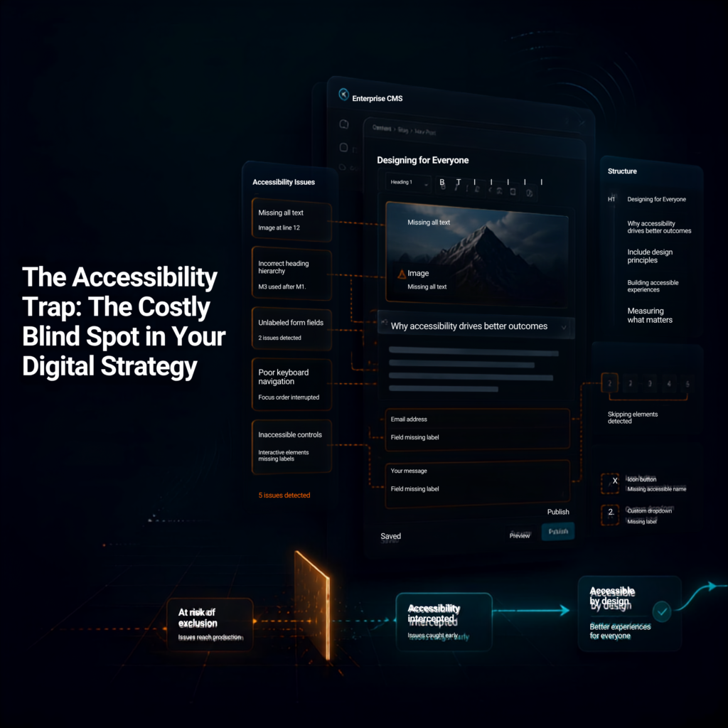
The Accessibility Trap: How ATAG Prevents Costly Accessibility Issues
August 14, 2026
By Disha Over the past three years of auditing digital products, I have witnessed the same story unfold across organizations of every size. But over the last year, the story has taken on a new urgency. I’ve been working closely with businesses that are completely new to digital accessibility. Most of them didn’t begin this […]
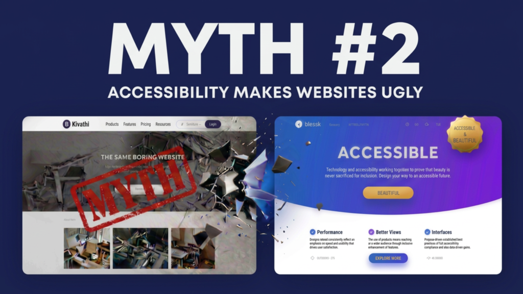
Myth #2: Accessibility Makes Websites Ugly
August 11, 2026
By Akashdeep, Founder & CEO of SaralX One of the oldest myths about digital accessibility is that accessible websites have to look plain, boring, or outdated. Many designers imagine accessibility as: Large black text on a white background Oversized buttons everywhere Simple layouts with no creativity Limited colors and typography A compromise between aesthetics and […]
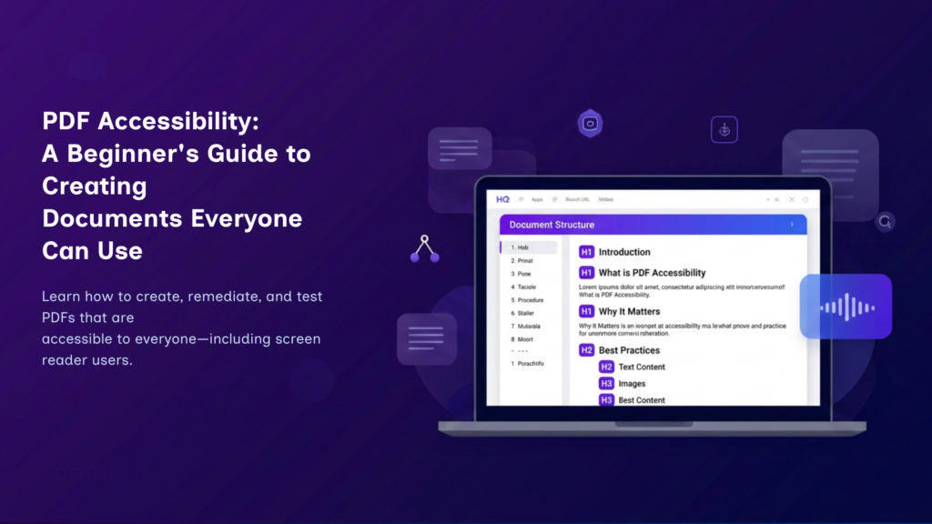
PDF Accessibility: A Beginner’s Guide to Accessible PDFs
August 9, 2026
By Manikanta If you’ve ever downloaded a document from a website, filled out an application form, or read an eBook, chances are you’ve used a Portable Document Format (PDF)—one of the world’s most widely used file formats. PDFs preserve a document’s layout, fonts, images, and formatting, ensuring that it appears consistently across different devices and […]
Myth #1: Digital Accessibility Is Only About Making Websites Accessible for People Who Are Blind
July 30, 2026
By Akashdeep, Founder & CEO of SaralX One of the most common misconceptions about digital accessibility is that it is meant only for people with blindness or low vision. This belief is understandable because screen readers and visually impaired users are often the most visible examples in accessibility discussions. However, this is only a small […]