
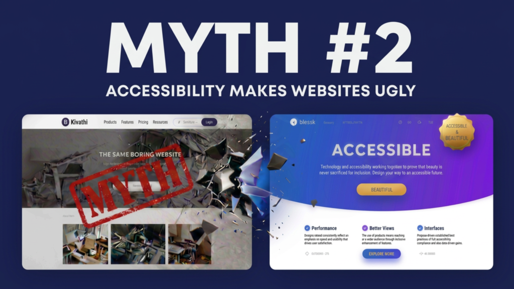
Myth #2: Accessibility Makes Websites Ugly
August 11, 2026
By Akashdeep, Founder & CEO of SaralX
One of the oldest myths about digital accessibility is that accessible websites have to look plain, boring, or outdated.
Many designers imagine accessibility as:
- Large black text on a white background
- Oversized buttons everywhere
- Simple layouts with no creativity
- Limited colors and typography
- A compromise between aesthetics and usability
Fortunately, none of this is true.
Modern accessibility standards do not dictate how your website should look. Instead, they define how people should be able to perceive, understand, navigate, and interact with your digital product.
Accessibility is about functionality—not forcing a particular visual style.
Where Did This Myth Come From?
Years ago, accessibility was often treated as an afterthought.
Organizations would first build a website and then try to “make it accessible” by adding quick fixes.
This often resulted in poor-looking interfaces because accessibility was being added on top of an existing design instead of being considered during the design process.
People wrongly concluded that accessibility was responsible for bad design.
In reality, poor implementation was the problem—not accessibility.
Accessibility Doesn’t Tell Designers What to Create
Contrary to popular belief, accessibility standards do not say:
- Use only black and white colors.
- Use only Arial font.
- Avoid animations.
- Don’t use images.
- Don’t use modern layouts.
- Don’t use gradients.
- Don’t use illustrations.
None of these are accessibility requirements.
Instead, accessibility asks questions such as:
- Is the text readable?
- Is there sufficient color contrast?
- Can users navigate without a mouse?
- Are buttons identifiable?
- Can screen readers understand the content?
- Are form fields properly labeled?
Notice that none of these requirements prevent creative design.
They simply ensure that creativity remains usable.
Beauty and Accessibility Can Coexist
Think about architecture.
A building can be visually stunning while still including:
- Ramps
- Elevators
- Accessible washrooms
- Tactile flooring
- Wide entrances
Nobody says these features make a building unattractive.
Instead, they reflect thoughtful design that welcomes everyone.
Digital products are no different.
A beautiful website can also be fully accessible.
In fact, many award-winning websites already are.
Good Accessibility Often Improves Design
Ironically, many accessibility improvements also make websites more attractive.
Better Typography
Readable fonts, proper spacing, and appropriate text sizes create a cleaner and more professional appearance.
Visitors spend more time reading content when it is comfortable to read.
Better Color Choices
Accessibility encourages sufficient color contrast.
This doesn’t mean using dull colors.
It means choosing color combinations that remain readable for everyone, including users with low vision or color blindness.
Many premium brands naturally meet accessibility requirements because they already prioritize visual clarity.
Cleaner Layouts
Accessible websites typically have:
- Clear visual hierarchy
- Consistent navigation
- Logical page structure
- Well-organized content
These principles are also fundamental to great user experience and modern design.
Better Buttons
Accessibility encourages buttons that are:
- Easy to identify
- Large enough to interact with comfortably
- Clearly labeled
These improvements benefit everyone, especially mobile users.
Accessibility Encourages Better User Experience
Imagine visiting a luxury hotel.
It may have beautiful interiors, elegant furniture, and impressive architecture.
But imagine if:
- Room numbers were impossible to read.
- Elevators had no buttons.
- Corridors had confusing directions.
- Doors had identical appearances with no labels.
Would you still call it good design?
Probably not.
Good design is not only about appearance.
It is about helping people accomplish their goals effortlessly.
The same applies to websites.
A visually impressive interface that users cannot navigate is simply poor user experience.
The World’s Best Products Prioritize Accessibility
Many of the products admired for their design also invest heavily in accessibility.
Their design teams understand that accessibility is not a restriction.
It is part of creating high-quality user experiences.
Users rarely notice accessibility when it is done well.
They simply describe the product as:
- Easy to use
- Intuitive
- Clean
- Professional
- Premium
Those are exactly the qualities every organization wants.
Accessibility Is About Inclusive Creativity
Accessibility does not reduce creativity.
It expands the audience that can appreciate your creativity.
A beautifully designed website that excludes millions of users cannot truly be considered successful.
Great design is measured not only by how impressive it looks but also by how many people can actually use it.
The best designers don’t choose between beauty and accessibility.
They deliver both.
Final Thoughts
The myth that accessibility makes websites ugly comes from confusing accessible design with poor design.
Accessibility does not ask organizations to sacrifice branding, innovation, or visual appeal.
Instead, it challenges designers and developers to create digital experiences that are both beautiful and inclusive.
The most successful digital products today demonstrate that accessibility and aesthetics are not competing goals—they are complementary ones.
When accessibility is considered from the beginning of the design process, organizations don’t end up with “accessible websites.”
They end up with better websites.
https://band.us/band/102033018/post/5
I think, that you are not right. I am assured. I can prove it. Write to me in PM, we will talk.
https://tablo.com/genres/classics/discussions/19248